What Building a Real Product Taught Me About UI Design
4–6 min read
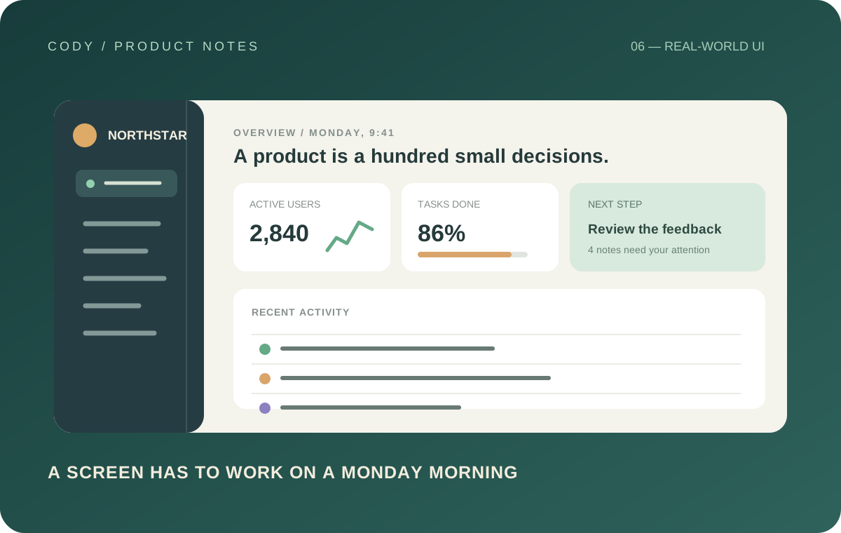
There is a huge difference between designing a beautiful screen and designing a real product.
I understood the difference intellectually before I started building a larger application. I didn't fully understand it until I had to deal with everything that exists outside the screenshots.
A design file usually shows the happy path.
The user has data. The network works. Nothing fails. Every image loads. Every button has somewhere to go. Nobody submits an invalid form. There are no empty states.
Real products don't work like that.
A product is made of states
One of the biggest changes in my approach to UI design came from realizing that a screen is not a single design.
It is a collection of states.
A listing screen can have dozens of properties. It can have one property. It can have no results. It can be loading. It can fail to load. A search can return suggestions. It can return nothing. A user can be logged out or logged in.
Each of those states affects the interface.
If you only design the perfect version, you are designing a picture rather than a product.
That distinction changed the way I build.
Empty states matter
Empty states are particularly interesting because they are often treated as an afterthought.
A developer finishes the main UI and then adds something like "No results found."
Technically, the job is done.
But the user experience isn't.
A useful empty state should explain what happened and, when appropriate, give the user a reasonable next step.
The same principle applies to saved items, messages, notifications, bookings, and dashboards.
The absence of data is still part of the product.
Cards aren't just rectangles
Working on a product with many different types of content also changed how I think about cards.
A card has a purpose.
A property card needs to communicate information quickly. A saved item may need different actions. A featured item may need visual emphasis. An agent card has a different hierarchy from a listing.
It is tempting to create one universal card component and force everything into it.
Reusable components are valuable, but reuse should not mean uniformity.
Sometimes the correct abstraction is a family of related components rather than one component with twenty boolean props.
That was an important lesson for me.
Navigation is part of the design
Another thing I underestimated was how much navigation affects the perceived quality of a product.
A screen can look perfect while the journey between screens feels confusing.
Where does a button lead? Can the user get back? What information should carry over? What should happen when the user opens something from a notification? What happens when they leave halfway through a form?
These aren't merely routing questions.
They are design questions.
The interface has to communicate the user's location and the consequences of their actions.
Design systems become more important as products grow
The larger the product became, the more obvious the value of a consistent design system became.
Typography needs rules. Spacing needs rules. Colors need rules. Icons need rules. Buttons need rules. Forms need rules. States need rules.
Without those rules, every new screen becomes another opportunity for inconsistency.
That doesn't mean every screen should look identical.
A good system creates consistency at the level of principles while still allowing different experiences to have their own identity.
Mobile made this even more obvious
Mobile interfaces are unforgiving.
There is less space, so hierarchy matters more.
A desktop interface can sometimes hide poor decisions because there is room everywhere. On a phone, every element competes for attention.
This forced me to question things I previously accepted.
Does this button actually need to be here? Does this label need to be this long? Can this action be secondary? Should these controls be visible all the time? Can the user understand this without reading a paragraph?
Those questions improved the interface more than adding visual effects ever could.
The best improvements are often invisible
Some of the improvements I value most are things users probably never consciously notice.
A button feels like it should be clickable. A form tells you exactly what needs fixing. A loading state prevents the screen from feeling frozen. A transition makes a change feel connected. A focus state makes keyboard navigation understandable. A search suggestion appears at the right moment.
None of these are flashy.
But together they create a product that feels intentional.
Building changed my definition of good UI
Before building larger products, I often judged an interface primarily by how it looked.
Now I judge it by how well it behaves.
Visual quality still matters. A product should look polished. But aesthetics are only one layer.
Good UI reduces confusion. Good UI makes important information easy to find. Good UI makes actions predictable. Good UI handles failure. Good UI respects the user's attention.
Most importantly, good UI works when reality doesn't match the designer's ideal scenario.
That is probably the biggest lesson building a real product has taught me.
A screenshot can demonstrate visual skill.
A functioning product demonstrates whether the design actually works.