Designing the Details People Don't Notice
4–6 min read
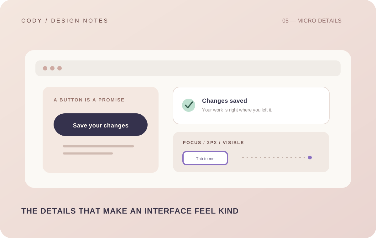
Some of the most important parts of an interface are the parts users never talk about.
Nobody usually says a focus state was beautifully implemented.
Nobody sends a message because the empty state had perfect spacing.
People don't celebrate a good loading skeleton.
They simply experience the product as smooth, clear, and trustworthy.
That is the interesting thing about details.
The best ones often disappear.
Loading is part of the experience
A screen that suddenly goes blank while data loads feels broken.
Even if the backend is working perfectly, the interface can communicate the opposite.
Loading states create continuity.
They tell the user that something is happening.
The exact solution depends on the product. Sometimes a spinner is enough. Sometimes skeleton content makes more sense. Sometimes progressive loading is better.
The important part is not the animation.
It is communication.
Empty states need personality and direction
An empty screen can either feel like a dead end or a natural part of the experience.
For example, a saved-items page with no saved items shouldn't simply look broken.
The user should understand that nothing has been saved yet.
When appropriate, the interface can suggest what to do next.
This small detail can make a product feel much more complete.
Errors need good UX too
Errors are inevitable.
Servers fail. Connections disappear. Users enter unexpected data. Third-party services stop responding.
The interface cannot prevent every failure, but it can decide how the failure is communicated.
A generic error message may technically be correct, but it doesn't always help.
A useful error state should answer as much as possible: what happened, can I try again, did my action succeed, do I need to change something, and what should I do next.
The goal isn't to hide failure.
It is to make failure understandable.
Focus states matter
Focus states are easy to forget because mouse users may barely notice them.
But keyboard users depend on them.
A visible focus indicator tells the user where they are.
It also communicates that the interface is interactive.
Good focus design should fit the visual system without sacrificing visibility.
This is a perfect example of a detail that can be almost invisible to one user and essential to another.
Micro-interactions create continuity
Small transitions can make interfaces feel connected.
A card opening into details. A menu appearing from an action. A button changing state after a successful operation. A saved item visually confirming that it was saved.
These interactions can reduce the mental gap between an action and its result.
But they should be used carefully.
If everything moves, nothing feels stable.
Forms reveal product quality quickly
Forms are one of the fastest ways to discover whether a product has been designed carefully.
What happens when the user enters an invalid value? Does the error appear too late? Is the field still understandable? Does the keyboard behave correctly on mobile? Can the user tell which fields are required? Does submitting show feedback? Can the user recover from a mistake?
A form that technically works can still be frustrating.
A well-designed form reduces the amount of thinking required.
Buttons should communicate consequences
A button should not only look clickable.
Its label should make sense.
"Submit" is sometimes technically accurate but vague. "Create listing" tells the user more. "Save changes" communicates what will happen. "Delete account" communicates a serious consequence.
The more meaningful the action, the more important the wording becomes.
Visual hierarchy and language work together.
Consistency builds trust
If one button behaves one way on one screen and differently somewhere else, users have to relearn the product.
The same applies to icons, spacing, dialogs, notifications, navigation, and form behavior.
Consistency reduces cognitive load.
It also makes a product feel more trustworthy.
Users don't need to consciously understand the design system.
They simply benefit from its predictability.
Details should serve the user
There is a temptation to add details simply to show that you can.
I try to ask a different question: does this detail make the experience clearer, faster, safer, or more enjoyable?
If yes, it deserves consideration.
If the answer is no, it might just be decoration.
The details people don't notice are not valuable because they are hidden.
They are valuable because they quietly remove friction.
That is the kind of polish I want in the products I build.
Not polish that screams for attention.
Polish that makes the entire interface feel like someone cared.